
Virtru: Enterprise encrypted email management
I redesigned Virtru’s administrative dashboard to address usability issues for enterprise IT admins managing encrypted email. The result was a streamlined experience that clarified user modes, reduced confusion, and laid the groundwork for future data-driven improvements.
My Role
Virtru needed a cleaner, more intuitive way for IT admins to manage encrypted email permissions. As lead UX designer, I collaborated across teams to simplify complex workflows, clarify personal vs. organizational roles, and explore future-facing data visualizations. The result was a redesigned dashboard that improved usability and laid the foundation for future enhancements.
My Role
I was responsible for:
Conducting user research and feedback sessions
Collaborating with product management and customer support teams
Designing and prototyping in Sketch
Integrating the Virtuoso design system into the dashboard
Challenges
Process
Solution
The final implemented design satisfied nearly all of the user feedback and enabled a much better experience for important enterprise users. Reorganizing access to personal settings and organization users provided a more understandable user interface. Removing confusing CTAs and providing useful content right away enabled admins to more efficiently and effectively manage their organizations encrypted emails.
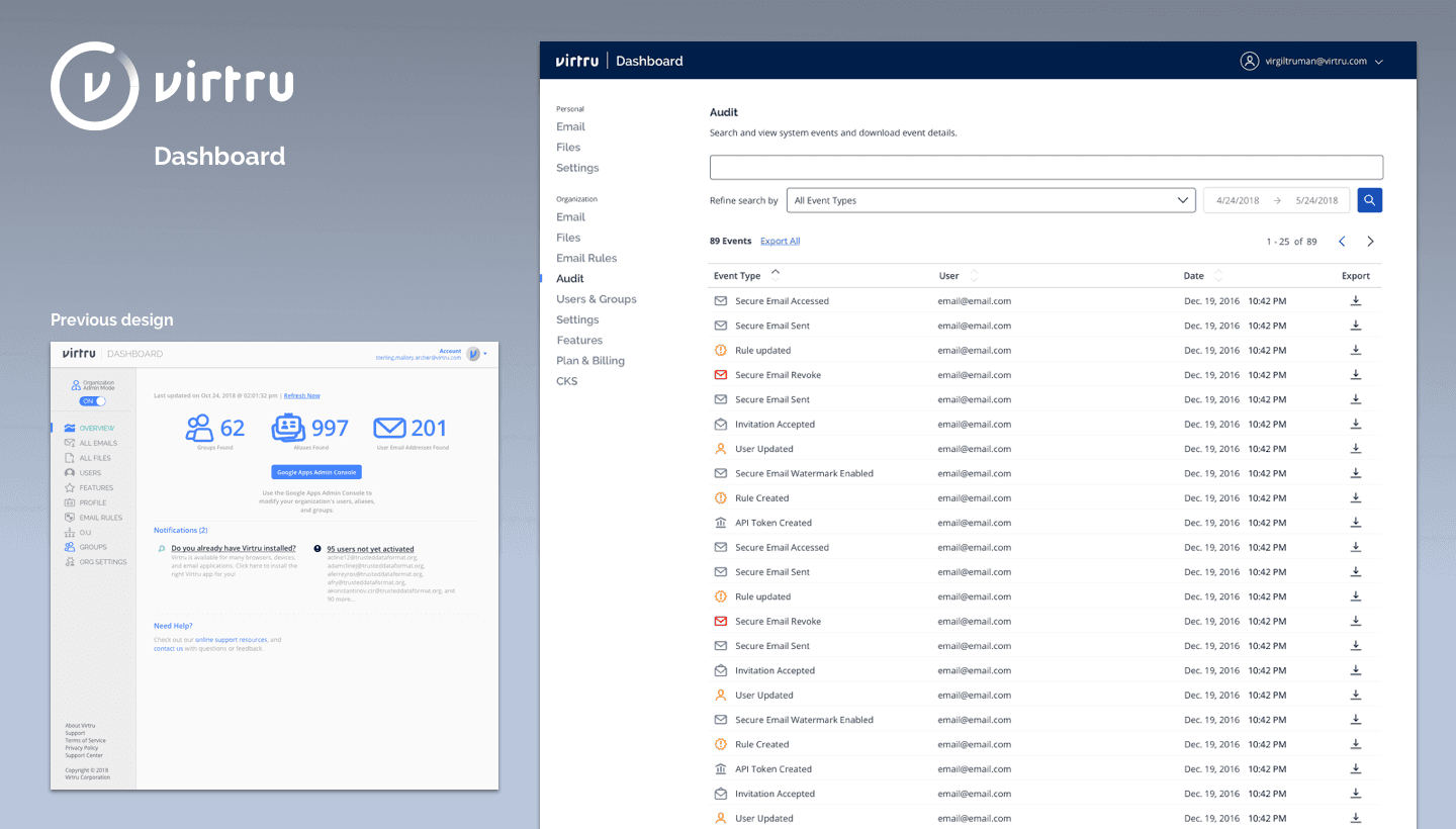
Prior Design
User feedback revealed several areas for improvement in the original management dashboard design.
The main content area’s messaging confused users asking them every time if they had installed the product.
The data visualizations lacked clarity, hindering understanding.
Additionally, the toggle switch between “personal” and “organization” modes wasn’t intuitive.
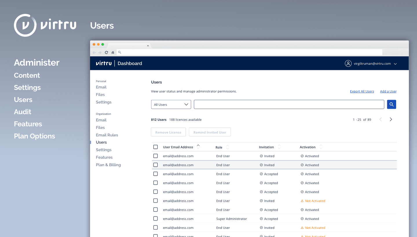
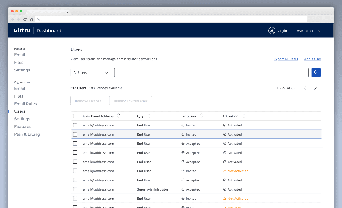
Redesigned
Users responded well to the new design which clarified the difference between personal and organization modes.
Removed ambiguity and confusing messaging
Using an updated taxonomy, it presented useful, actionable information right away instead of requiring additional clicks to view important details.
The addition of search and filters greatly simplified finding issues, particularly when auditing problems.
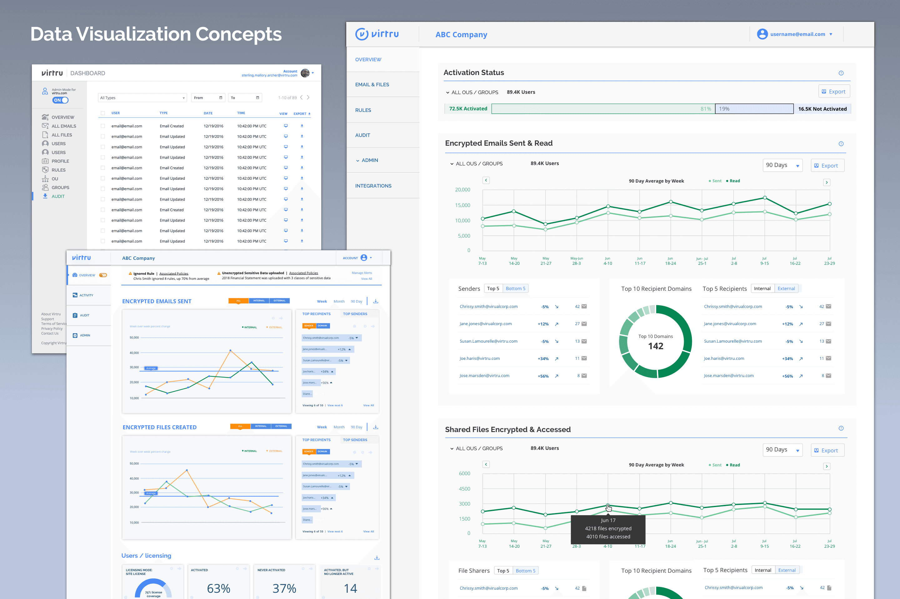
Visualization explorations
Early in the project, the scope was wide open, so I worked with product management to explore how data visualizations could help admins make sense of usage and adoption trends. We brainstormed ways to surface key insights—like activation rates and engagement over time—that would make the dashboard more actionable. While we didn’t have the resources to build them out, users responded well to the concepts, and they helped inform future roadmap planning.
Skills & Tools
Related Project: Virtuoso Design System